Absolute Joker in DC’s Absolute Batman: Design, Role, and Story Impact
Absolute Joker in DC’s Absolute Batman
The absolute joker is DC’s reimagined take on the Joker for the Absolute imprint, a publishing line that relocates the publisher’s most recognizable icons into a darker, more grounded continuity. Where the classic Joker has spent decades evolving through countless creative voices, the absolute joker is presented as a deliberate counter-design to Absolute Batman, a version of Bruce Wayne who never inherited wealth and built his war on crime from scratch. That structural choice gives the absolute joker a different origin pressure, a different visual vocabulary, and a different narrative role, which is why readers and writers keep using the character’s name as shorthand for the new direction rather than as a simple cosmetic update.
This article focuses on what is known about the absolute joker through DC’s editorial framing and the published first issues, then explains why the design choice matters for the broader Absolute line. The goal is to give comic readers, design-curious game developers, and writers who follow DC’s publishing calendar a structured breakdown of a character that is being treated as both a story engine and a branding pillar.
What “absolute” means in DC’s publishing line
The Absolute imprint is DC’s label for stories that take a familiar character and remove the safety net of their usual continuity. The label was launched in 2024, with Absolute Batman written by Scott Snyder and illustrated by Nick Dragotta as one of the flagship titles. The premise is simple on the surface and ambitious in execution: rebuild the character’s origin without the inherited resources, allies, and assumptions that have supported them for decades.
For Absolute Batman, that means a Bruce Wayne who is a former government engineer rather than a billionaire heir, working with Alfred as a former Black Ops handler rather than a family butler, and building his arsenal through engineering, surveillance, and partnerships rather than through a fortune. The visual language, the supporting cast, the locations, and the threat profile are all adjusted to match that premise. Even Gotham itself reads differently, with the city’s geography redrawn to support a Batman who has to improvise his reach rather than purchase it.
The absolute joker exists in that same space. The character is not introduced to replace the classic Joker, but to function as a counterweight whose design choices make sense only when read against this stripped-down Batman. That relationship is the editorial reason the absolute joker has its own identity rather than a recolored version of the existing character. The imprint’s stated goal, in interviews and press materials around launch, was to let each Absolute title stand on its own, and that requirement is what forces each antagonist to be rebuilt rather than reused.
It is also worth noting that the Absolute line sits beside DC’s main continuity rather than inside it. The publisher has treated Absolute as a parallel track since launch, which is why a character like the absolute joker can carry the Joker name without forcing a continuity rewrite. That parallel-track structure is unusual for a major publisher and is one of the reasons the imprint is being watched closely by retailers, librarians, and trade press.
Who is the absolute joker?
The absolute joker is the central antagonist of Absolute Batman, a version of the Joker built specifically to challenge an unresourced Bruce Wayne. The character is first surfaced in the early issues of the title, with DC releasing the character’s full visual reveal in a press cycle ahead of issue coverage. Before the reveal, Snyder and Dragotta used horror-style imagery, a single green glove, and silhouettes to seed the design across covers, previews, and social media.
That rollout was deliberate. The creative team treated the absolute joker reveal as a narrative event, not as a marketing one, which matters because the reveal is structured to land as a story beat in a comic rather than as a cover variant. For readers who follow the title, the absolute joker is the figure on the other side of Absolute Batman’s new mission; for readers who only saw the rollout, the character is the green glove behind the first arc’s violence. The reveal was staggered across cover variants, retailer incentive covers, and interior splash pages, which is a publishing pattern that DC has used selectively for high-profile character introductions.
The character’s role in the title is to be a mirror of Bruce Wayne’s stripped-down life. The absolute joker is presented as a product of a system that failed the same way Gotham failed Bruce, which gives the rivalry a class and social dimension that the classic Batman and Joker pairing has only occasionally explored. That structural symmetry is also what makes the character useful to the rest of the Absolute line, because the same mirroring logic can be applied to other Absolute titles as the imprint expands.
For readers picking up the title cold, the practical answer to “who is the absolute joker” is that the character functions as the Joker role in an Absolute continuity: a primary antagonist with a personal connection to the protagonist, a recognizable visual hook, and a thematic reason to exist in this version of Gotham. The difference is in how each of those elements has been rebuilt, which is what the rest of this article covers in detail.
Design differences from the classic Joker
The absolute joker is visually distinct from the classic version. The design choices fall into a small number of editorial buckets, and each one ties back to the Absolute imprint’s premise of removing inherited resources and inherited aesthetic conventions. Working through those buckets is the clearest way to understand why the absolute joker reads as a different character rather than as a variant cover.
Costume and color palette
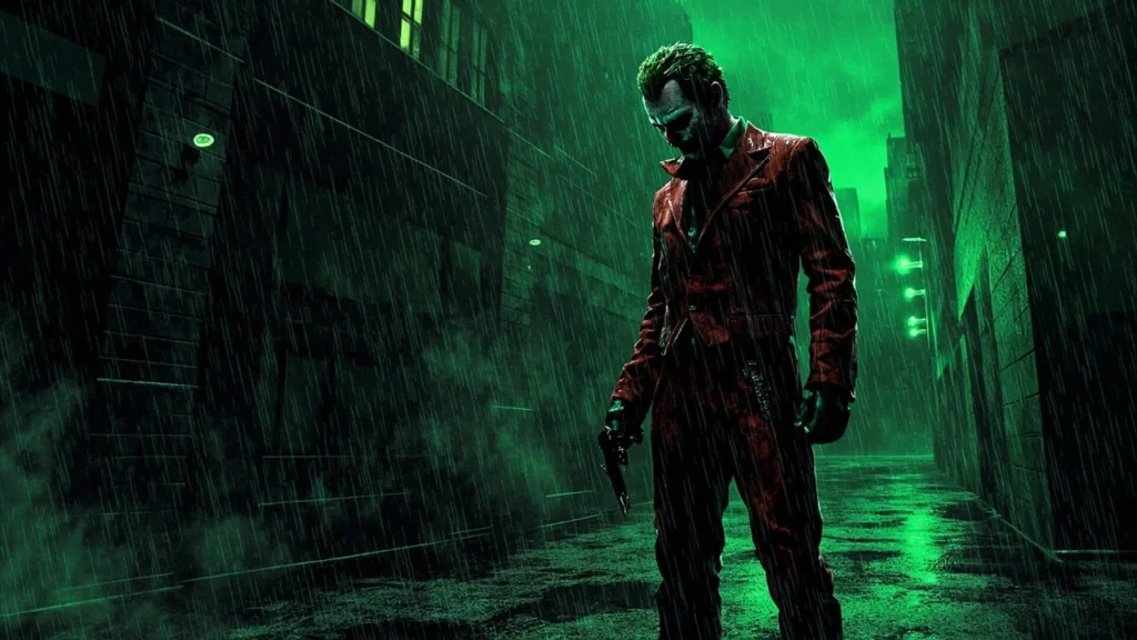
The classic Joker is anchored by a bright purple suit, a green shirt, and clown makeup that reads as performance. The absolute joker works in a darker palette, with muted reds, grays, and a single sharp green accent that has become a visual signature. The goal is to make the character feel more grounded in the Absolute Gotham rather than imported from a more theatrical continuity. The costume also drops the formal coat-and-tails silhouette in favor of outerwear that reads as street clothing, which is part of why the absolute joker can appear in working-class Gotham settings without breaking the visual register.
This palette shift is the most visible difference to readers who only know the classic character. It also has a practical effect: the absolute joker no longer reads as a clown in a parade, but as a figure in a city, which makes the character easier to place in a wider range of comic panels without breaking the visual tone of the title. That flexibility is important for a flagship title, because the antagonist has to remain readable across splash pages, quiet scenes, and crowd sequences without the palette doing all the work.
The single green accent has its own job to do. It functions as the cover and interior shorthand for the character in the same way that a single red stripe or a single yellow highlight would, and it lets the absolute joker sit inside a wider range of color compositions without losing identity. That kind of single-accent design is uncommon in mainstream superhero comics and is one of the reasons the absolute joker is being studied by character designers outside the comic industry.
Body language and posture
The Dragotta design uses a more grounded body language than the classic Joker. Posture is functional, weight is on the ground, and the silhouette is closer to a street-level threat than to a showman. That change is editorial: the absolute joker is positioned as a counter to an unresourced Batman, which means the character has to read as a believable physical threat before any theatrical detail is layered in. The body language also gives Dragotta more room to vary the silhouette across pages, because the absolute joker can be drawn leaning, crouching, or standing without losing the read.
That grounded body language is also a deliberate counter to the classic Joker’s performance posture. The classic Joker frequently uses a wide stance, an open chest, and exaggerated gestures to occupy a scene. The absolute joker uses the opposite: closed body, weight low, hands often out of frame until a specific beat. The result is a character who reads as dangerous in stillness rather than in motion, which is a different kind of stage presence and a different kind of threat.
Horror and silhouette framing
In the lead-up to the full reveal, the absolute joker was framed through horror imagery, a single green glove, and partial silhouettes. That framing is now part of the character’s design DNA. The absolute joker is presented as someone who can move through a scene without showing the full costume, which is closer to a horror protagonist’s reveal pattern than to a classic comic book villain introduction. The approach is also useful in interiors, because the absolute joker can be staged at distance or in low light without the page losing the read.
Horror framing also gives the creative team room to vary the reveal. The same character can be introduced as a glove, as a silhouette, as a partial face, or as a full figure, and each reveal carries a different amount of information. That staging tool is something Dragotta has used in other projects, and its application to a flagship DC title is one of the design reasons the absolute joker’s first arc has been picked apart by working illustrators.
Why the absolute joker matters to the Absolute imprint
Editorial imprints live or die on whether their flagship antagonists can carry the same weight as the characters they were built around. The absolute joker carries that weight because the character’s role is not to repeat the classic Joker’s dynamic, but to reframe it for a continuity where Batman has fewer safety nets. That reframe is what gives the imprint a reason to exist beyond a publishing label, and it is what gives the absolute joker a slot in the wider conversation about DC’s direction.
Three structural reasons explain why the absolute joker has become a focal point of the Absolute line rather than a supporting antagonist.
- Imprint anchor. The character is the visual and tonal counter to Absolute Batman, which is the imprint’s flagship title. The pairing defines what the imprint feels like even before the reader has read a page, which is a useful property for a label that has to justify its shelf space at retail.
- Design flexibility. The muted palette and horror framing give the absolute joker more room to evolve across arcs without breaking the title’s visual language, which is a real asset for a long-running title rather than a one-shot project.
- Narrative leverage. A villain who mirrors a stripped-down Bruce Wayne gives the writer a way to escalate stakes through a single character rather than through a rotating rogues gallery, which is also a more efficient use of page count for a flagship.
Each of those reasons is a production consideration as much as a creative one. The Absolute imprint is a publishing bet, and the absolute joker is one of the assets that the bet is structured around. That context matters when reading interviews with the creative team, because a lot of the design language is being explained in terms of how it serves the imprint’s business model rather than in terms of pure art direction.
How the absolute joker is written in early issues
The writing approach to the absolute joker follows the same premise as the design: the character is built as a counter to Absolute Batman rather than as an echo of the classic Joker. In the published first issues, the absolute joker is positioned as the product of a system that failed the same way Gotham failed Bruce Wayne. The character’s dialogue leans on environment, history, and class rather than on theatrical one-liners. That choice also changes how the absolute joker can be paced across an issue, because a quieter voice leaves more room for sound design and page layout to do the work that a classic Joker monologue would normally carry.
That writing choice matters for the broader tone of the Absolute line. The classic Joker’s voice has shifted across decades, but a version of the character that can sit in a grounded, lower-case Gotham needed a different rhythm. The absolute joker’s pacing in early issues reads as slower, more conversational, and more tied to the specific street and the specific victim than the classic Joker’s set-piece monologues. The result is a villain who feels local in a way that the classic Joker rarely does, which fits the Absolute line’s stated interest in rebuilding Gotham as a place rather than as a backdrop.
For writers studying the title, the practical takeaway is that the absolute joker’s voice is built from the world first and the character second. The character says what the city around him would say, and the personality is layered on top of that voice rather than imposed over it. That ordering is unusual for a flagship antagonist, and it is one of the reasons the absolute joker is being cited in craft discussions as a useful counter-example to villain writing that relies on personality to drive dialogue.
Comparing the absolute joker to the classic Joker
The two characters share a name and a slot in the rogues gallery, but they are written for different continuities. A side-by-side comparison makes the editorial difference easier to see, and it also clarifies what the Absolute imprint is trying to accomplish. The table below covers the attributes that trade readers and design writers tend to cite when they compare the two characters, and it is meant as a working reference rather than as a final word on either version.
| Attribute | Classic Joker | Absolute joker |
|---|---|---|
| Continuity context | Decades of post-Crisis, New 52, Rebirth, and other continuity resets | Launched inside the 2024 Absolute imprint |
| Visual palette | Purple suit, green shirt, clown makeup, theatrical silhouette | Muted reds, grays, single green accent, ground-level silhouette |
| Body language | Performative, exaggerated, showman-driven | Functional, grounded, weight on the ground |
| Origin framing | Multiple contradictory origins, often tied to a single bad day | Tied to Gotham’s systemic failure, mirroring Bruce Wayne’s origin |
| Tonal register | Horror comedy, theatrical violence, recurring one-liner motifs | Social horror, slower pacing, environment-driven |
| Relationship to Batman | Defined by contrast with a resource-heavy, institutionalized Batman | Defined by contrast with an unresourced, engineer-built Batman |
| Role in the title | One of many rogues gallery anchors | Primary narrative mirror for the flagship title |
The comparison is not a value judgment. The classic Joker is a generational villain built for a Batman who has institutional reach, and the character’s theatricality is part of how that dynamic reads. The absolute joker is built for a Batman who has to invent his own reach, which is a different kind of rivalry and a different kind of horror. Both versions have an internal logic, and both versions will probably continue to exist in parallel because they serve different story briefs.
| Production area | Classic Joker approach | Absolute joker approach |
|---|---|---|
| Cover treatment | High-contrast color, full figure, variant covers built around the costume | Lower contrast, partial figure or silhouette, variant covers built around the reveal |
| Interior staging | Center stage, dominant silhouette, set-piece panels | Off-center, environmental staging, panels tied to specific locations |
| Color budget | Two-color costume plus makeup, heavy use of secondary purples and greens | Muted base palette plus one green accent, used sparingly |
| Writer room reference | Theatrical reference, performance, gag-driven motivation | Social reference, systemic failure, class-driven motivation |
| Reader read at a distance | Bright color, broad posture, immediate recognition | Single green accent, narrow silhouette, recognition after staging |
The second table is more useful for design and production readers, because it focuses on how each character is built on the page rather than on the page’s narrative role. That distinction matters for anyone trying to translate either version of the character into another medium, because the production choices that make the classic Joker work in a comic are not the same choices that make the absolute joker work.
Why the absolute joker design matters beyond comics
Designers, illustrators, and concept artists who work in games treat character redesigns like the absolute joker as case studies for a reason. The character’s visual choices are anchored in editorial constraints, not in mood-board preferences, which makes the result useful for anyone trying to ship a redesign under real production pressure. The same constraints show up in game pipelines, where art direction has to answer to a publisher brief, a tech budget, and a release window, and a redesign that ignores any of those inputs is unlikely to ship.
Constraints as a creative driver
The absolute joker exists inside three constraints: the Absolute imprint’s stripped-down continuity, Nick Dragotta’s illustration language for the title, and a story premise that requires the character to be a believable threat. Each constraint shapes a specific design choice, from the muted palette to the grounded posture. That pattern is what game art directors try to reproduce when they ask for “a character that fits the world,” and the absolute joker is a useful case study because the constraints are visible in the published work rather than hidden in production notes.
For studios working on licensed or first-party titles, the absolute joker is also a useful reference for how a high-profile character can be redesigned without losing the read. The character’s name and slot in the rogues gallery carry the recognition, and the design choices carry the new direction. That division of labor is something game art teams try to set up early in pre-production, and the absolute joker is one of the cleaner published examples of how it can work in a flagship title.
Reveal structure
The pre-reveal rollout for the absolute joker is structured as a horror reveal, with a single green glove and silhouettes carrying the character through cover variants and preview pages. That reveal pattern is the same one used in horror games and horror-adjacent shooters to introduce antagonists without giving the player the full model until the first encounter. Studying the rollout gives artists a working example of how a reveal can be paced in a publication that has to sell a character before the writer’s first scene is read. The same pattern also works in marketing materials, because each stage of the reveal can be turned into a separate beat for press coverage without burning the final design.
The reveal structure is also useful as a production reference for studios that have to ship a character reveal alongside a roadmap. The absolute joker was revealed across multiple touchpoints, with each touchpoint carrying a different amount of information. That staging lets the publishing team control the rate at which readers learn the design, and it is a pattern that game studios have used for years around DLC characters, raid bosses, and seasonal antagonists. The absolute joker is a clean published example of the same logic applied to a print-first product.
Color as a brand asset
Single-color accents are a familiar trick in character design, but the absolute joker’s single green accent is doing specific work. The accent ties the character to the cover and promotional palette of the Absolute line without locking the absolute joker into a color that the rest of the title is using. That separation is the same logic game art teams use when they want a character to read as a brand mark without competing with the protagonist’s hero color. It is also why the absolute joker’s promo art can be paired with other Absolute covers without losing the read: each cover carries its own color, and the green accent holds the character together across them.
For brand and marketing readers, the absolute joker’s color logic is also a working example of how a single accent can do the work of a full palette. Studios that have to ship a character across multiple SKUs, regional variants, and crossover events can use the same approach to keep the character recognizable without burning color budget on every asset. The absolute joker is one of the more usable published references for that approach, because the accent is consistent across covers, interiors, and promotional art.
What the absolute joker tells readers about DC’s direction
Reading the absolute joker as a signal of DC’s direction is a fair exercise, because flagship antagonists tend to carry the imprint’s editorial weight. The absolute joker’s design choices, from the muted palette to the class-driven origin, line up with the Absolute line’s stated interest in rebuilding characters without their usual support structures. The character is also a signal that DC is willing to commit to a parallel-track imprint rather than folding new ideas into the main line, which is a publishing decision that has implications for retail, trade press, and library cataloging as much as it does for storytelling.
For readers who follow DC’s publishing calendar, the absolute joker is also a signal about how the Absolute line is likely to expand. If the absolute joker works as a flagship antagonist, the same mirroring logic can be applied to other Absolute titles, and the design language developed for the absolute joker can be reused as a reference point. That is how a flagship character becomes a brand asset: the design choices stop belonging to a single title and start belonging to the imprint. The absolute joker is early enough in that process that the pattern is still visible, which is part of why the character is being discussed in design forums rather than only in comic press.
Practical takeaways for comic readers and game developers
For comic readers, the practical takeaway is that the absolute joker is a separate continuity version of the Joker, built for the Absolute imprint’s premise, and not a replacement for the classic character. The two can be read in parallel, and the absolute joker is best read as part of the Absolute Batman title rather than as a standalone character study. For readers who only know the classic Joker, the absolute joker is also a useful reset point: the character’s design and voice are different enough that the first arc can be read without prior knowledge of decades of Joker continuity.
For game developers and concept artists, the practical takeaways are the constraint-driven design, the staged reveal, and the single-accent color logic. Each of those choices is documented in the published work, which is what makes the absolute joker useful as a case study rather than as a mood board. Studios working on licensed characters can also use the absolute joker as a reference for how a high-profile character can be redesigned without losing the read, and how a parallel-track imprint can carry a redesign without forcing a continuity rewrite in the main line.
Where the absolute joker fits in the wider DC reading order
For readers building a reading order, the absolute joker sits inside the Absolute Batman title and, by extension, inside the Absolute imprint. The character is not part of the main DC continuity, and the absolute joker’s appearances outside the imprint have not been formally announced. That means a reader who only follows main-line DC can ignore the absolute joker without missing a story beat, and a reader who follows the Absolute line can read the absolute joker without having to track main-line continuity.
For trade readers and librarians, the absolute joker is also a useful case study in how parallel-track imprints are cataloged. The Absolute line is treated as its own continuity, and the absolute joker is treated as its own character for cataloging purposes, even though the name and the rogues gallery slot match the classic Joker. That distinction is worth keeping in mind when building reading lists or collection development policies, because treating the absolute joker as a variant of the classic Joker will lead to misfiled material.
Frequently asked questions
Who is the absolute joker in DC’s Absolute Batman?
The absolute joker is DC’s redesigned version of the Joker for the Absolute imprint, introduced as the central antagonist of the Absolute Batman title launched in 2024. The character is built as a counter to an unresourced Bruce Wayne rather than as a recolor of the classic Joker.
When was the absolute joker first revealed?
The absolute joker was teased through cover art and previews in the lead-up to the Absolute Batman creative team’s promotional cycle, with the full visual reveal published in the first arc of the title. DC’s rollout used a single green glove and horror-style silhouettes before the final design was shown.
How is the absolute joker different from the classic Joker?
The absolute joker uses a muted palette, a grounded silhouette, and a slower, more conversational tone than the classic Joker. The character’s origin is tied to Gotham’s systemic failure rather than to a single theatrical “bad day,” which is the editorial reason the design has fewer costume flourishes.
Who writes and draws the absolute joker?
The absolute joker is written by Scott Snyder and drawn by Nick Dragotta as part of the Absolute Batman creative team. Design choices in the title are shared between writer, artist, and DC’s editorial group, with the cover and interior design coordinated to keep the character’s visual language consistent across issues.
Does the absolute joker replace the classic Joker?
No. The absolute joker is a separate continuity version of the character, published under the Absolute imprint, and is not a replacement for the classic Joker in DC’s main line. The two characters can exist in parallel because the Absolute imprint is treated as its own continuity.
What does “absolute” mean in DC’s publishing line?
The Absolute imprint is DC’s label for titles that rebuild familiar characters without the inherited resources, allies, and assumptions of their main-line continuity. Absolute Batman, which launched in 2024, is one of the imprint’s flagship titles, and the absolute joker is built specifically for that premise.
Is the absolute joker a good fit for game adaptations?
The absolute joker’s grounded silhouette and single-color accent make the character easier to translate into game art pipelines than more theatrical versions of the Joker. The character’s reveal pattern is also a useful reference for game studios that need a horror-style antagonist reveal under tight production schedules.
Where can I read about the absolute joker’s reveal process?
Coverage of the absolute joker reveal has been published in comic news outlets, with detailed reporting on the rollout from AIPT Comics, which tracked the progression from early horror hints to the full visual reveal. The same coverage notes the editorial reasoning behind the staged rollout, and the broader Absolute imprint is documented on Wikipedia as a reference for the publishing context.
Will the absolute joker appear in DC movies or animation?
As of this article’s current date, the absolute joker is a publishing-only character tied to the Absolute imprint. The character’s presence in film or animation depends on DC’s broader adaptation plans for the Absolute line, which have not been formally announced for the Joker’s role.
What is the editorial point of redesigning the Joker for the Absolute line?
The editorial point is to give the Absolute imprint a flagship antagonist whose design choices reinforce the imprint’s premise. By stripping the Joker of the theatrical palette and tying the character to Gotham’s systemic failure, the Absolute line gets a villain that reads as a mirror to its unresourced Batman, and the absolute joker’s reveal process is itself a working example of how the Absolute line is built to stand on its own. Reporting on the reveal from AIPT Comics has tracked that progression from horror hints to full reveal in detail.